Friday, 4 October 2013

Head in the clouds


After months of hard workSTUDIOKCA's “Head in the Clouds” pavilion made of 53,780 reclaimed plastic water bottles finally popped up on Governors Island for the participatory art fair, and invited festival-goers to enter the pillowy structure to experience it from within.
They wanted to create a space where dreamers could dream and putting your head (and body) inside of a huge cloud felt right. You can lose yourself in the light as it shifts through the blue and white re-purposed bottles that were used to construct the exterior and interior of the cloud-shaped pavilion
300 volunteers from the Emerging NY Architects Committee, the Structural Engineers Association of NY, and the FIGMENT arts organization joined hands with STUDIOKCA’s Jason Klimoski and Lesley Chang to construct the recycled pavilion, which was the winner of this year’s “City of Dreams” design competition. STUDIOKCA sourced the thousands of bottles that make up the installation from all over the city from both individuals and businesses. While Head in the Clouds was designed to be a light-hearted, fun experience for visitors to the island, it also calls attention to the nearly 48 million plastic bottles thrown away every day in the US. In fact, STUDIOKCA took great care to size the pavilion to represent the number of plastic bottles thrown away in New York City in just one hour – about 53,000 bottles.


Head in the Clouds was built upon a 40 ft long x 18 ft wide x 15 ft high frame of curved aluminum tubes fitted together with clamps that was then covered with “pillows” made of 1 gallon water jugs woven with netting. The inner ceiling of the pavilion was lined with smaller plastic water bottles filled with blue water dyed with organic food coloring to glint and glitter in the sun. 


Lepsis Terrarium

As global populations continue to grow, our appetite for meat is likely to cause severe resource shortages in the not-so-distant future. To address the problem, a recent UN report suggested that people should be eating more insects, because they're much less harmful to the environment that traditional meat. But for that to become a reality, we'll need a way to grow and harvest insects - and that's where designer Mansour Ourasanah comes in. Ourasanah has created the Lepsis, an attractive insect breeder that could be used to grow grasshoppers in an urban home. This clever design was recently nominated for the world's largest design prize - the 2013 Index: Award.

Ourasanah collaborated with KitchenAid to develop the Lepsis, a small, decorative unit that can rest on a kitchen counter. The unit addresses the question of how to produce large amounts of protein without devoting more land space to the cultivation of insects, and it was just announced as a finalist in the INDEX awards. According to Ourasanah, 80 percent of the world population already eats insects, and introducing edible bugs to rapidly-expanding urban populations could significantly reduce the impact of meat production on the environment.
The Lepsis is a vessel that can be used to grow insects for food. The product consists of four individual units that are each designed to breed, grow, harvest and kill grasshoppers, and they combine to form a decorative kitchen product. “In order to move toward a sustainable future, we must do away with our culinary hangups and redefine the paradigm of food,” explains Ourasanah. Even though growing and eating insects is pretty repulsive to many people in the developed world, an attractive product like the Lepsis could help people to warm to the idea.


These portraits of electronic musicians and DJs by Spanish illustrator and designer Alex Trochut show one image during the day and another at night
Alex Trochut screenprinted two different images onto the same surface using black and phosphorescent ink in a checkerboard grid of tiny squares. When seen in the light the portrait printed in black is visible, but if viewed in the dark a different image suddenly appears.

Trochut told Dezeen that he developed the technique first and then decided on a suitable subject matter: "I thought that if I could show two different images it made sense to work on the idea of there being two sides to someone's personality."
The portraits reflect the notion that the musicians and DJs depicted, including Four Tet, Acid Pauli and Damian Lazarus, transform and come alive at night.
Binary Prints was first shown earlier this month at Sónar+D, the innovation and technology area at the Sónar arts and music festival in Barcelona, where many of the musicians have previously played.
Trochut initially used the idea of a camouflaged image for the cover of his monograph More is More, which featured a hidden pattern printed in glow-in-the-dark ink.
Recently launched at Sonar Music Festival, Binary Prints by illustrator and designer Alex Trochut, is an ingenious technique that he's invented to allow him to illustrate two completely different images on the same surface, one visible by day the other only visible by night.
For his first series Trochut has teamed up with some of the biggest names in electronic music such as James Murphy, Four Tet, Damian Lazarus, John Talabot and many more to create a series of portraits that explore the people behind the music.
These nocturnal images wake up when the lights go out, just as DJs come alive at night, they glow in the dark to reveal a nocturnal persona, an icon of music and sound.
The inaugural exhibition of Binary Prints will present this first series of DJ portraits, which will continuously grow as more artists are added and the show continues to tour music festivals and galleries around the world.


Cortex 3D-printed cast


3D-printed casts for fractured bones could replace the usual bulky, itchy and smelly plaster or fibreglass ones in this conceptual project by Victoria University of Wellington graduate Jake Evill.
The prototype Cortex cast is lightweight, ventilated, washable and thin enough to fit under a shirt sleeve.
A patient would have the bones x-rayed and the outside of the limb 3D-scanned. Computer software would then determine the optimum bespoke shape, with denser support focussed around the fracture itself.
The polyamide pieces would be printed on-site and clip into place with fastenings that can't be undone until the healing process is complete, when they would be taken off with tools at the hospital as normal. Unlike current casts, the materials could then be recycled.
At the moment, 3D printing of the cast takes around three hours whereas a plaster cast is three to nine minutes, but requires 24-72 hours to be fully set," says the designer. "With the improvement of 3D printing, we could see a big reduction in the time it takes to print in the future.
After many centuries of splints and cumbersome plaster casts that have been the itchy and smelly bane of millions of children, adults and the aged alike, the world over, at last fracture support has been brought into the twenty-first century.
The Cortex exoskeletal cast provides a highly technical and trauma-zone-localised support system that is fully ventilated, super light, shower friendly, hygienic, recyclable and stylish.
The Cortex cast utilises the x-ray and 3D scan of a patient with a fracture and generates a 3D model in relation to the point of fracture.


It doesn’t matter if you’re a 2 year old learning to climb your first step, or a veteran architect conceptualizing a monolithic spiral, we’re all fascinated with stairs. It seems so obvious, most of us tread on them everyday, but when creative minds shed a new perspective on the common architectural necessity, that regular staircase can become visual gold. Architects Sergey Mishin and Katya Larina of Studio Mishin teamed up with Daniel Llofriu Pou and Alberto Arguimbau of Arup to build a beautifully illuminated, perforated copper staircase for Michin’s new Villa Mallorca.
In the early months of 2010, Studio Mishin contacted the technical architects and engineers at Arup. At this point the villa was largely complete but still needed a central staircase. Spanning three floors, the architect’s vision consisted of an imposing staircase that lies at the central heart of the building and creates a visual link by the use of perforated copper panels throughout the interior and exterior of the building.
Specialist advice was necessary to finish the detail design, engineering and construction of this unique proposal. Arup´s Materials Consulting and Lighting Design´s teams in Berlin began to work on the practicality of realizing and building the copper cladding. The detailed design of the complex structure is based on a limited set of panel types and interface geometries to allow for a consistent appearance and an efficient procurement. The installation is sequenced in such a way that the structural panels interlock with each other and a delicate substructure to minimize visible connections.
The lighting design accentuates the geometry of the perforations of the copper panels through backlighting, with dramatic lighting from above to reveal the texture and material properties of the copper and laminated wood. An innovative approach to both maintenance and construction for the lighting elements was also a critical element of the success of the project. The result of such a detailed process is a clad with almost 200m² of composite panel, including treated copper, bonded and structural timber with approximately 12,000 perforations made by a CNC water jet cutter.


Enzo Mari

"I am convinced," writes Enzo Mari at the opening of his autobiography, 25 ways to drive a nail , "that design corresponds to a deep human instinct like survival, hunger, sex. We are a species that wants to change its environment." More than the sequence of events in Mari's life, which is perhaps the book's pretext rather than its end, the driving force of 25 ways ... is the desire to express this principle through theoretical discussions and concrete examples; the desire, so to speak, to manifest the bridge linking design to human life.
The book, edited by Barbara Casavecchia, follows the life of Enzo Mari almost chronologically and is grouped around a few core themes that also provide reference points for his work as a designer: from his apprenticeship when, as a young and inexperienced 'gofer,' he alternates his first design work with odd jobs and even a little fraud as a street vendor, to his relationship with art; from his commitment to centering his work on labor conditions—one of Mari's cornerstones—to the disappointment of seeing his principles ignored or perverted by successive generations. From a purely narrative point of view, the story is captivating. It is, after all, the story of an incredibly talented visionary, whose passion and curiosity lead him through the birth and explosion of one of the core disciplines of the 20th century (in terms of its intellectual charge, in terms of its innovation, in terms of its economic power)—design.


Computer-Generated Portraits Created From Images Of The Universe


The Barcelona-based artist's latest project sees him creating a series of portraits based around the concept of nucleosynthesis or "the process of creation of new atomic nuclei from pre-existing matter that takes place at cosmic scale". To do this he'll be sourcing images from the Hubble Space Telescope and using them to generate images using custom software from user-submitted pictures, resulting in some abstract portraits dotted with stars, galaxies, cosmic dust, and other space matter.
The artist sees the project as an experiment, one in which he hopes to create as many portraits as possible over a certain time period (it started on 18th of June 2013 and seems to be still going) using an automated process to aid him. Anyone can submit a portrait online and Albiac will create three portraits, what he calls "generative collages", from the submission mixed with images from Hubble.
The project, as well as creating unusual and totally cosmic portraits of people, aims to look at how technology can help an artist to realise and create more artworks than they could do on their own. He explains on the project's web page:
Life is finite. Creativity isn't. An artist has the potential to create infinite artworks but only some of them will see the light due to the constraint of time. What if we use technology to outsource the creation of art so more of these potential artworks are finally created? Modelling artistic decisions into software would provide a generative assistant that could even survive an artist in the creation of meaningful works of visual art. This project is a first experiment around this concept.
Albiac has been exploring the idea of generative portraits for some time, creating still images of his subjects fromrandomized newspaper clippings, before moving on to moving image portraits where he used online videos to generate a video painting of the Queen of England. And now he's decided to give technology even more control. It's not unusual for artists to outsource their work, artists like Damien Hirst and Mark Wallinger outsource the creation of their art to project managers and teams of young artists. Albiac is outsourcing it to software.


Karl Lagerfeld designs new restaurant for hotel


Karl Lagerfeld, head designer and creative director for Chanel, was chosen by Hotel Metropole Monte-Carlo - which won "Best Hotel in the World 2010" - to create a unique poolside piece, named "Ulysses' Journey around the Mediterranean Sea", inspired by Homer's epics: the Iliad and the Odyssey .
Lagerfeld's work is always very elegant and his unique and timeless style was perfect to take the Hotel Métropole Monte-Carlo to a new level. They were not only thinking about Odyssey as a place to swim and tan, but rather as a living space.
The mural fits perfectly with the rest of the Monaco-based hotel's decor, which was designed by world famous interior designer Jacques Garcia in 2004 combining the glorious past with the feel of the Mediterranean and 21st century contemporary luxury.
Lagerfeld's bespoke installation is made up of twenty panels, measuring 18x3 metres, in which photos of models in togas are superimposed onto black and white images of Greek coastlines from 1850-60. The scenes are backlit by LEDs which change according to the surrounding natural lighting which adds to the intimate atmosphere and ambience.
Adjacent to the pool, the hotel is opening its third Joel Robunchon dual concept restaurant 'Odyssey' in June. 'Odyssey' will be a Michelin-starred eatery by day, and a destination bar with live music and DJs, and Robunchon canapés by night - where Lagerfeld's masterpiece can be admired by all.


Alma Residence


This project was conceived to fulfill a two-part problematic: (1) Residence Alma--a Tyrolean guest house with 6 holiday apartments from the 1960s adorned with a pitched roof--was due for a common circulation and service core, and (2) the project architect, Ulla Hell, was looking for a new home for her young family of five in the mountain community of Sesto, Alto Adige. The result: an under-utilized roof space gave way to an angular crown, connected to a ground floor reception space and architectural office by the host’s renovated spine.
The interior of this family home is characterized by 360-degree views. Perhaps the most spectacular of these being a view of the sky through an incision over the central stair. This opening delivers an immediate reading of exterior weather conditions, collecting precipitation and receiving direct sunlight.
The main living spaces are split over two floors with first floor bedrooms off a skylit corridor, and an open plan kitchen, dining and family room encircling a fireplace on the second floor. By grouping functional elements in orthogonal cores, the surrounding space is liberated. The exterior walls of the main living spaces collapse inwards to catch light, views and varying degrees of enclosure.
All living spaces in the private residence have direct access to the outside through a series terraces or gardens. Its multiple access points include: a main entrance through an internal connection to the neighbouring house, a series of openings that follow the natural topography, and an external stair connecting the third floor terrace to the garden. Each inhabitant has come to find their own favourite route.
Limited material and colour palettes give strength to the space, with splashes of colour in the children’s washroom. The otherwise white walls provide a backdrop for an ever-changing display of shadows from the pleated roof above. 

As the extension sits within the steep topography, substructural elements were developed in reinforced concrete, while the superstructure was built from prefabricated cross laminated timber (CLT) insulated with wood fiber and sealed with black bitumen. The outer skin in larch wood strips on a galvanized steel structure was determined according to cost and aesthetics by the aforementioned parametric model. A consistently limited colour code was applied to the exterior, allowing the volume to dissolve into the surrounding hillside when viewed from afar.

Through its use of form, materials and views, this newly completed addition flirts with its context at three scales. The first, and most immediate, with its host: as an addition to the Alma residence, it shares a newly renovated core, carrying the fractal geometry from the roof down to Plasma’s Italian office through the Alma’s cartesian skeleton. The second, with its neighbour: together the Strata and the Alma define the next generation of the family-owned hotel complex. And finally, with its terrain: the sculptural addition acts, not as a parasite, but as a mediator between the existing house and surrounding topography, extending from the landscape like a lichen.


Thursday, 3 October 2013

Diogene House


This is a tiny house which, despite its modest dimensions, is completely self-sufficient and has everything needed for a normal person’s living. It was named Diogene, after the antique Greek philosopher Diogenes of Sinope, and designed by a famous Italian architect Renzo Piano.
According to the architect, he has dreamed of a project like this since his student days, but back then he was unable to realise it. In 2000, Renzo decided to develop this project for himself, without any particular client. This work resulted in several prototypes, made of plywood, concrete and wood. The latter was published in 2009 in Italian design magazine Abitare, where it was noticed by Rolf Fehlbaum, chairman of Vitra AG. Rolf felt attracted to the idea and immediately contacted Renzo, inviting him to carry out the project together. Finally, after three years of joint work the most recent prototype of Diogene was presented at the Vitra Campus.
Diogene is a small house for one person, assembled from wood and coated with aluminium panelling. Its dimensions are only 2.5 x 3 x 2.3 metres. Despite this, the authors managed to find space for a living room with a pull-out sofa and desk, toilet with a pan and shower as well as a small kitchen with a sink, cooking top and fridge.
Although the appearance of Diogene creates the impression of a very simple house, it is literally packed with modern engineering systems that allow it to go without local urban infrastructure and to be placed almost anywhere. Everything that Diogene needs for functioning it gets literally from the sky: solar panels provide the house with electricity; rainwater is collected and filtered in special tanks under the house, and, when required, heated by a boiler on the roof. The selection of materials and triple glazing insure insulation, which allows efficient use of natural ventilation.
The authors of the project suggest using Diogene as a weekend house, studiolo or a small office; it allows its owner to escape from everyday rush and find peace and solitude. A group of such houses can be also used as an informal hotel or guest house. Diogenecurrently exists only as a test prototype and the decision of its further development and series production will be made later based on the reaction of the audience.


Overlap Rome: Past and Present


The still Untitled project comes from artist Kowalski personal need to change the world, to show how the city of Rome has changed over the decades and how it’s grown into an incredibly busy and complex metropolis. Each image consists of 3 to 5 photographs taken at different times and representing different architectural periods. Put together, they fall into places, dance with each other in an unexpectedly symbiotic way, co-existing in the mosaic of shapes and colors, symbolizing strength, diversification and synergy of the Rome as we know it today.
I feel that this project highlights an important fact that is often forgotten in current times: Your past makes you what you are today. The deliberate overlapping of multiple photos of the same subject at different times not only makes the photo more interesting but it also shows the process of change that makes the landscape what it is today. Everyday something changes about a person or an environment but not many people take notice until after a long period of time has passed. The compilation of photos show us what we could have missed everyday, every moment. We spend so much time focusing on material needs and never took the time to see the changes happening around us. 


Embryo


Embryo is a cylindrical two story tree dwelling that again utilises the principles of bio mimicry by imitating the organic curves found in nature. The design of the structure gives the illusion that it is almost part of the tree trunk like a Burl. It is clad with cedar shingles to blend the structure in with the surroundings.
The Embryo derives its name from the early stages of development in nature and how we need to re address the way we live in today's society that is more ecological and a simpler way of living than consuming our earths resources. We are more and more being disconnected from our natural surroundings and the embryo is part of a series of designs to try and reunite and reconnect us back to the elements and how we interact with nature, whilst using materials resourcefully.
The Embryo is attached to the tree using a series of braces that do not interfere with the growth of the tree or cause damage to the bark of the trunk. The entrance is through a hatch door which leads up to the first floor and again up to the second floor via steps that spiral upwards on the internal walls of the cylinder. This allows maximum floor space and makes it capable of sleeping up to 8 people. There are three different designs of windows to the structure which can be custom made to suit each tree house depending on the light levels of the surrounding area.


Endless stair


London-based architecture firm dRMM has designed The Endless Stair, a highlight of the 2013 London Design Festival, located on the lawn in front of the world-renowned Tate Modern.
The project is the brainchild of architect Alex de Rijke, founder of architects dRMM and Dean of Architecture at the Royal College of Art, working to a commission from the American Hardwood Export Council, and engineered by Arup. As well as providing an exciting experience with several platforms from which to enjoy views down towards the Thames, the project has a serious technical purpose to showcase the potential of cross-laminated timber (CLT) panels made from American tulipwood.
When we think of a staircase, we think of an inclined walkway composed of treads, vertically connecting the various levels of a building–an area of transition in architecture. the endless compositional and social possibilities of these structures is what has driven UK-based firm dRMM to explore their potential in the form of ‘endless stair’. the temporary sculpture has been realized as a series of single staircases which can be interlocked with one another–a three-dimensional exercise in framework, composition and scale; sometimes leading nowhere, often leading somewhere. each component of this pre-fabricated construction plays an important role in the additive system and is easily demountable, so that it can be set-up on another site. 
Visitors can climb up, down, over and under the structure, with some stairs leading from one to another and others to dead ends. Initially proposed to sit next to St Paul’s Cathedral, the installation was relocated to the lawn in front of Tate Modern, the famous art gallery housed in a former power station on the south bank of the river.


Zen Garden


The re-activation of an industrial warehouse as part of Adelaide's burgeoning arts scene has resulted in this dynamic installation, a three-dimensional drawing. Leanne Amodeo reports.
Adelaide has long had a thriving independent arts scene characterised by a shifting group of dynamic artist-run-initiatives (ARIs). Over the years they have nurtured a vast number of emerging talents that have gone on to great success.
The evolving artistic landscape means that new ARIs continue to pop up, replacing the ones that close down, and this keeps the scene enlivened. Fontanelle is one such gallery and since opening eighteen months ago it has impressed with a tightly curated program of innovative exhibitions.

A highlight of this program is the current exhibition by Adelaide-based Sam Songailo. It cements Fontanelle’s place as a hub of artistic vigour as well as reinforcing the local artist’s capacity for creating energetic immersive installations.
His Zen Garden is a large three-dimensional drawing in black and white. Lines run the length of the main gallery’s floor – interrupted by sporadic ‘rock’ clusters – and evenly spaced rectangles cover the walls. Songailo’s repetitive patterns have a seductive quality to them and the overall effect is not at all frenetic.
The artist intended to invest his installation with a sense of reflection and calm, and he succeeds. But any suggestion Zen Garden is solely concerned with nature and meditation is inaccurate. There’s an inherent grittiness in Songailo’s line work; it acts as a reminder that this space is actually anything but a Zen garden.
His strong affinity for urban built environments is what makes Songailo’s response to this interior resonate. Fontanelle is, after all, a former run-down warehouse in the semi-industrial inner-city suburb of Bowden. That the artist has lent it a kind of restrained beauty is an unexpected yet welcome outcome.
Zen Garden is not typical of Songailo’s brightly coloured public installations, however its duo-tone simplicity stands in nice contrast to the artist’s urban body of work. It also makes the hint of pink glimpsed through the doorway of Fontanelle’s second gallery an even more intriguing gesture.
Songailo deliberately uses this accent to full effect although it is a separate exhibition by fellow Adelaide-based artist Emily Taylor. His understanding of spatial considerations and awareness of structural details ultimately makes Zen Garden a memorable experience.

Wednesday, 2 October 2013

Empire Drive-in

For consecutive summers, New York City has had increasing offerings of outdoor film screenings. The locations range from parks, to restaurant backyards, to rooftops and beaches. Now, the concept has an added popular vintage twist: a drive-in.

Not just your usual run-of-the-mill drive-in, which in itself would be cool and intriguing enough, but Empire Drive-In is a junk car drive-in, upcycling wrecked cars rescued from junkyards and repurposing them as seats for audience members to climb into, and onto, while watching films projected on a 40-foot screen made of salvaged wood. 

The masterminds behind the project are Jeff Stark  and Todd Chandler. These two Brooklyn-based artists have previously created other Empire Drive-Ins, most recently last year at the Abandon Normal Devices Festival in Manchester, UK. Stark and Chandler, along with a team of other artists and craftspeople have set out, in this age of consumerism, to create a sense of possibility  by focusing on re-use, designing something new and special while salvaging and repurposing waste. 

In cleaning up the cars, which will have stereo audio transmitted via radio directly to each car, the crew found all kinds of interesting personal artifacts from car deodorizers to letters, which they have chosen to keep in the cars to “create a story”. This perhaps urges the audience to explore further the concept of "one man's trash is another man's treasure".


Secret Operation 610


In collaboration with studio Frank Havermans, dutch designers Rietveld Landscape has developed ‘Secret Operation 610‘ for Vrede van Utrecht 2013 (The Peace of Utrecht festival).
When aircraft Shelter 610 opens its ruthless doors, a monstrous black behemoth slowly comes driving out. The object revives the mysterious atmosphere of the Cold War and its accompanying terrifying weaponry. At an almost excruciatingly slow pace, the artwork uses its caterpillar tracks to cross the seemingly infinite runway. Due to this brutal object’s constantly changing position in the serene landscape, it allows the visitor to experience the area and the history of the military airbase in new ways.
At the same time, the artwork functions as a working environment for researchers. Their temporary stay creates opportunities for innovative research programs that otherwise would be impossible. For example, inside the object, students of the Technical University Delft (Aerospace / CleanEra) will develop a program for the innovative flying of the 21st century: “no noise, no carbon, just fly”. The old runway is the perfect test site for state of the art aviation experiments.
The mobile sculpture and shelter 610 are perfect spaces for research, experiment and innovation for groups coming from various disciplines. The unconventional combination of nature and Cold War history offers an exciting environment for the development of knowledge about nature, technology and aviation.


Thermobooth

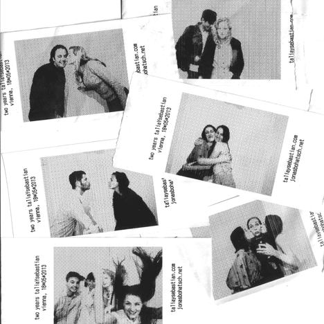
Thermobooth is a project by Vienna designer, taliaYstudio, in collaboration with digital designer Jonas Bohatsch. 

This photo booth detects when subjects kiss, fires a high-tech OLED flash and captures the moment on a low-fi thermal print-out plus video. 
Visitors to the booth stand on a "smart carpet" connected to a Makey Makey circuit board. When they make skin contact by touching or kissing, an electrical circuit is completed. This triggers the camera and causes an array of circular OLED lights (OLEDs: organic light-emitting diodes; emit light across a surface rather than from a point.) to provide a flash of light. A thermal printer then prints a photo. 

The first version of Thermobooth was housed in a found Ikea chest of drawers and presented at a party in Vienna earlier this year. It was really ugly but it did the trick and the guests went quite mad about it. The studio then approached lighting brand OSRAM, who provided circular OLEDs to power the flash. Even when the resistance is lowered the OLEDs still gives out more light. Also, they don't blind the eyes and have a beautiful soft illuminating quality to it. The studio decided to stick with thermal printouts because thermal printing is quick and dirty in its look and it holds some of the nostalgia of instant analogue photography. The final version of the project features an irregular cloud of circular, mirror-fronted OLEDs mounted on painted steel poles. A thermal printer is housed in a triangular orange box set atop further steel poles. 

I feel that Thermobooth not only captures a physical image but it captures the feeling the subjects felt in that particular moment when their skin comes into contact and the flash illuminates and amplifies everything in that very time frame. This project focuses on human contact which is very much taken for granted in the current fast-paced and materialized society.


19th century architecture


The 19th century architecture is mainly characterized by the application of various historical styles and the development of new materials and structures.

Among the many styles present at that time, The Gothic Revival style probably stood out the most. This architectural movement started in the late 1740s in England. It became popular in the early 19th century when admirers of Neo-Gothic styles made efforts to revive medieval Gothic architecture while Neo-Classicism was prevailing then. A wide range of religious, civic and domestic buildings were constructed and furnished in this particular style that was flourishing then. Gothic Revival architecture varied in its focus towards both ornamental styles and medieval origin’s principles of construction. Architectural elements such as pointed arches, steep-sloping roofs and ornamental openwork patterns were frequently used. Contemporary materials and construction methods are also applied.

The emergence of new materials resulting from new industrial needs was also a vital part of 19th century architecture. A product of Industrial Revolution, cast iron was most popular for architectural use. It was widely used for a number of reasons. It is a cheaper way to reproduce ornate facades. More complicated structures could be mass produced quickly. Prefabrication of cast iron made it portable, such that an entire building could be built in one place and be shipped worldwide. The molds for cast iron can also be reused, which can be utilized to produce architectural catalogs of module patterns for future clients. The molds also made repair of damaged parts easier.

John Ruskin was one of the most influential art critic during the 19th century and his interest lied in Medieval Architecture. This particular interest was aroused by his travels in Europe where he did detailed watercolor studies regarding decoration and colour of buildings. The Seven Lamps of Architecture and The Stones of Venice are two of his most important book which had great impact on the Gothic Revival. The spiritual values of Middle ages are often lost with the mechanized and materialistic era which Ruskin lived in and I find it a huge relief that there are still people like him who cares about values beneath the surface.


Francis Bacon


Francis Bacon was born to an English family in Dublin, Ireland on 28 October 1909. He was known for his figurative painting that often portrayed themes of isolation and suffering.
Bacon left home at the age of sixteen and spent two years traveling. When he chanced upon Pablo Picasso’s exhibition in Paris, he was instantly inspired to start painting. Although Bacon initially intended to establish himself as an interior decorator and furniture designer, he eventually turned to painting exclusively.
Bacon’s provocative and disturbing paintings were not sudden sparks of inspiration. As a teen, he often came into violent arguments with his chauvinistic and severe father. His decision to leave hime was triggered by unappeasable differences regrading his sexuality. Despite a difficult relationship, he had in fact admitted to being sexually attracted to his own father. 
Personal life aside, Bacon could not hold a stable job. He often quit due to boredom or misconduct. He managed to get by with a pitiful amount of his mother’s trust funds, dodging his rent and petty thefts.
All these constant reminders of failure, coupled with the destructive relationships with the lovers in his life, resulted in these twisted paintings that reveals his tortured soul.    
Bacon’s paintings usually involve a single male figure situated in a small enclosed space as if trapped in a solitary hell.
“Three Studies For Figures At The Base of a Crucifixion” and “Study After Velazquez’s Portrait of Pope Innocent X” (also known as The Screaming Pope) are two of his more popular works. 
“Three Studies For Figures At The Base of a Crucifixion”, a triptych painted by Bacon in 1944 was the big break for him. 
The painting was his interpretation of the three goddesses of vengeance (Alecto, Megaera and Tisiphone) that originated from Greek mythology.
The goddesses’ responsibilities were to punish crimes that were beyond human justice. The distorted figures imitate the corruption of human spirit and Bacon’s extreme loathing towards man’s humanity to man.
“The Screaming Pope” painted by Bacon in 1953, was regarded as his masterpiece and the inspiration behind the painting has intrigued many scholars. 
The painting I have uploaded is only one of the forty-five paintings that Bacon did between 1951-1965. His obsession with the subject was so severe that it was rumored he had to inflict violence on himself to force himself to stop the study of Velazquez’s popes. 
Inspired by Vincent Van Gogh’s transformation of artworks he admired by Eugene Delacroix and many others, Bacon often replaced the pope’s head with the screaming face of the injured nurse destroyed by soldiers’ gunfire on the Odessa Steps in Eisenstein’s film Battleship Potemkin. This transformation overthrew the idea of power and self-assurance portrayed by Velazquez. The screaming mouth, set apart from other facial features and isolated from any form of communication, shows experiential agony. Bacon accentuates human vulnerability and loss of faith by rendering space frames that makes the figures look as if it’s “enclosed in the wretched capsule of the human individual”.